
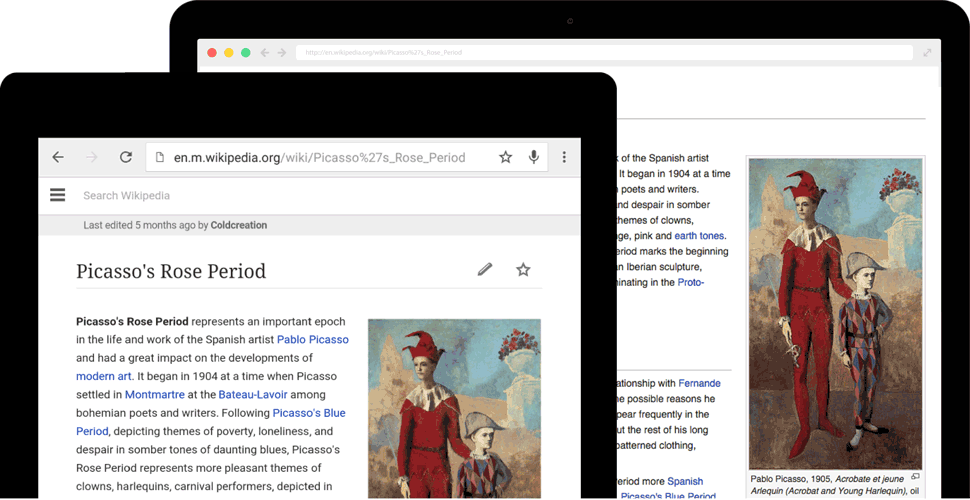
Role – I collaborated with another designer to initiate the Typography update in 2012 for mobile web & desktop. Prior to this typography update, we had more than 20 arbitrarily defined type sizes on desktop alone, low contrast for headings and incorrectly rendered glyphs. The type size for body copy, captions, references was too small for readers, and the tight leading made long form reading quite difficult. We wanted our users to sense accuracy, reliability, and clarity from the core visual elements of Wikipedia, just like the actual content they were reading.
Responsibilities – Define the value proposition of the typography update, propose a font stack for latin and non latin scripts, test on Mac OS, Windows, Linux; and engage in wide community discussion to understand issues & gather consensus. Proposing a CSS stack which maintained the visual character of the site, yet addressed the issues of glyphs and diacritics in non latin scripts was a complex undertaking.
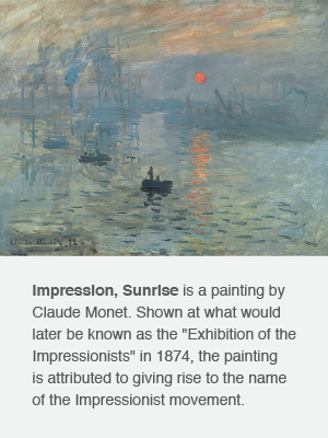
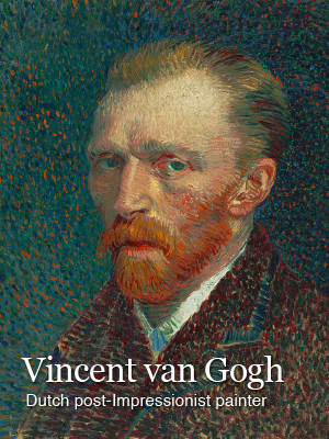
With this update, we sought to achieve better balance & cohesiveness for users to efficiently scan articles or engage in long form reading. Functional problems with our older type styles were first addressed on mobile web. This gave us a chance to test larger type sizes, increased leading, and serif headings. When this tested well with readers we brought these changes over to desktop along with a much wider set of spacing/styling fixes. This typography is what you experience on any Wikipedia site today and affects 500M readers in 287 languages.
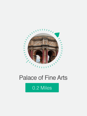
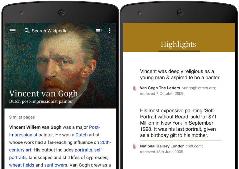
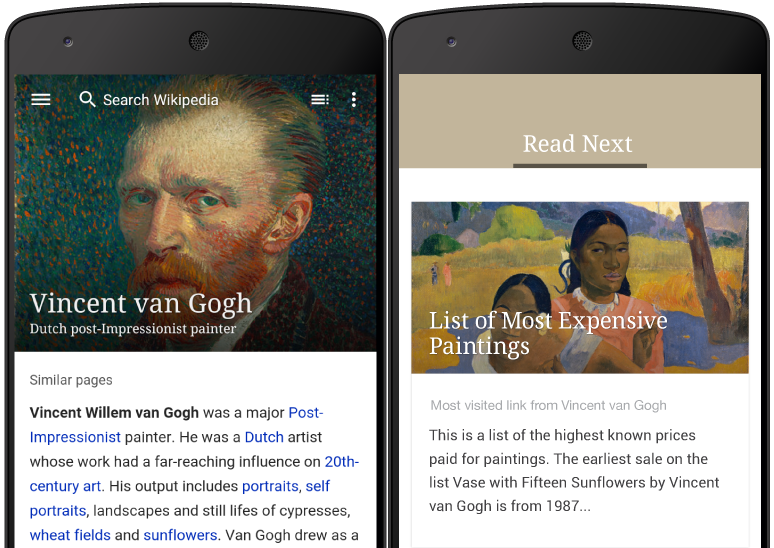
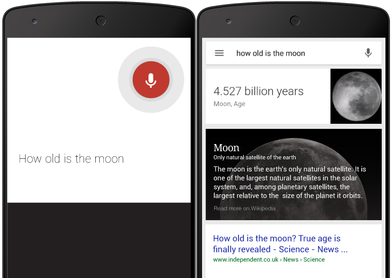
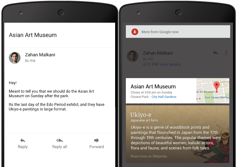
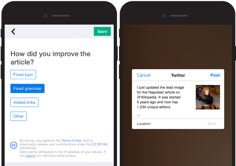
Role – I initiated and executed design for Link Preview cards as a 20% project. The readability of many first sentences is low on Wikipedia, due to writing style and usage of uncommon words. I believed that link previews could be a cross platform component which combined the right amount of content and imagery to help a user learn quickly. Further, these could enable sharing of Wikipedia content on other networks.
Responsibilities – Feature definition, value proposition, prototyping, layout refinements based on text display, character display issues for non latin scripts, scope, testing and facilitation.
My work from desktop enabled us to speedily ship this feature on Native apps. Link events have seen a 25-30% rise because of this feature, with a small percentage of users click through to the target articles which implies that readers get the required context from the preview card. In the feedback surveys, users mention that details such as the 'Last Edited' caption reminds them of the living nature of Wikipedia articles.
Role – In addition to working on desktop and mobile web features, I lead design for the native apps team.
Responsibilities – As a product designer my responsibilities included developing reader personas, experience flows, high fidelity prototypes, testing, research, quarterly planning, and communications.
Over the course of a year, we launched a native Android app. The first set of basic goals were to carry a mobile first presentation and support the quick lookup case. A second set of goals was giving readers a reason to use the app vs mobile web. For the first goal, I proposed a prominent lead image with a quick description and a clean first fold. These ideas were difficult to accomplish due to missing API's and structured data. I made multiple videos and storyboards to rally the developer community around this proposal. Along with a researcher and 2 developers, I planned out of box research to gauge how this composition impacted a user’s ability to quickly learn. The revamped presentation with a clear purpose has brought us to feature on the play store, rank 6 in the reference category, hit 15 million downloads and significantly affects retention. The backend services created are now able to support other platforms and are helping us drive better presentation and feature parity. For the second set of goals, we are currently working towards casual contributions and platform integration with google for 'now on tap’ opportunities in email, messaging and 3rd party reader apps.

Role – As a product designer, I had to establish the value of a cleaner clutter free reading experience, develop reader personas, propose quarterly plans for a native experience, design experience flows, produce high fidelity prototyes (pixate, screenflow, hype); test experimental builds and work with communications.
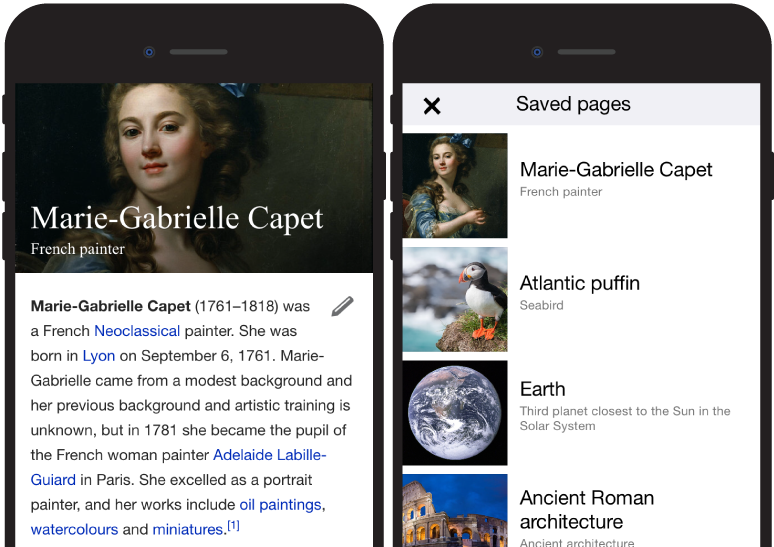
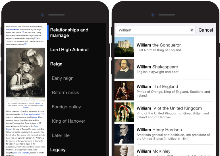
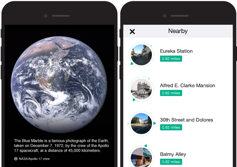
Responsibilities – I lead a major re-design for the native iOS app. The previous version was a web view in a native wrapper and had next to zero retention. With a tandem development cycle, I proposed that we split experiments between iOS and Android. On iOS, our first set of crucial goals was to make search faster and more visual, enable browsing within an article and encourage small and frequent contributions. iOS is the first platform where we see readers coming back to their saved pages, which has signifantly contributed to rentention. Features like browsing nearby and sharing facts from Wikipedia on social networks differentiates it from mobile web. With the average user, time on session has increased to 3 minutes, with more enagaged percentile of users visiting 17-19 articles per session. My research & prototyping have greatly helped to establish a paradigm for design quality and attention to detail.